Задача
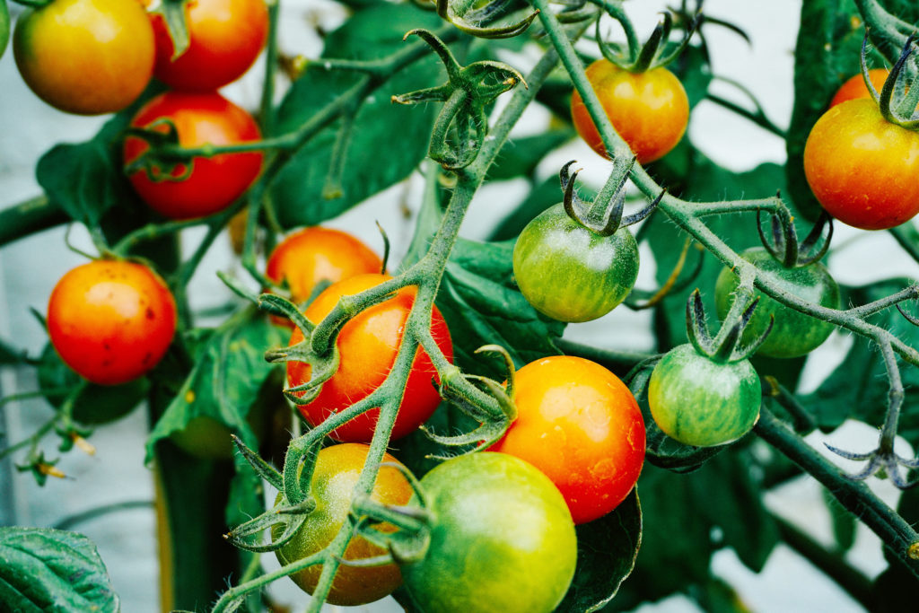
Начав в разработки основного бренда тепличных овощей компании Агроинвест «Моё лето», мы сотрудничаем не первый год над созданием различных линеек свежих томатов и овощей.
Решение
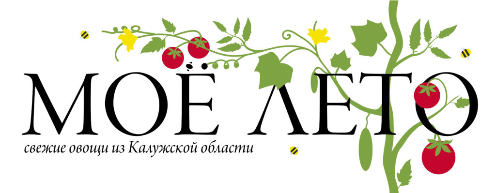
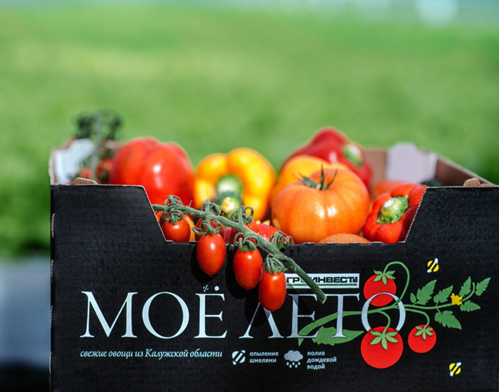
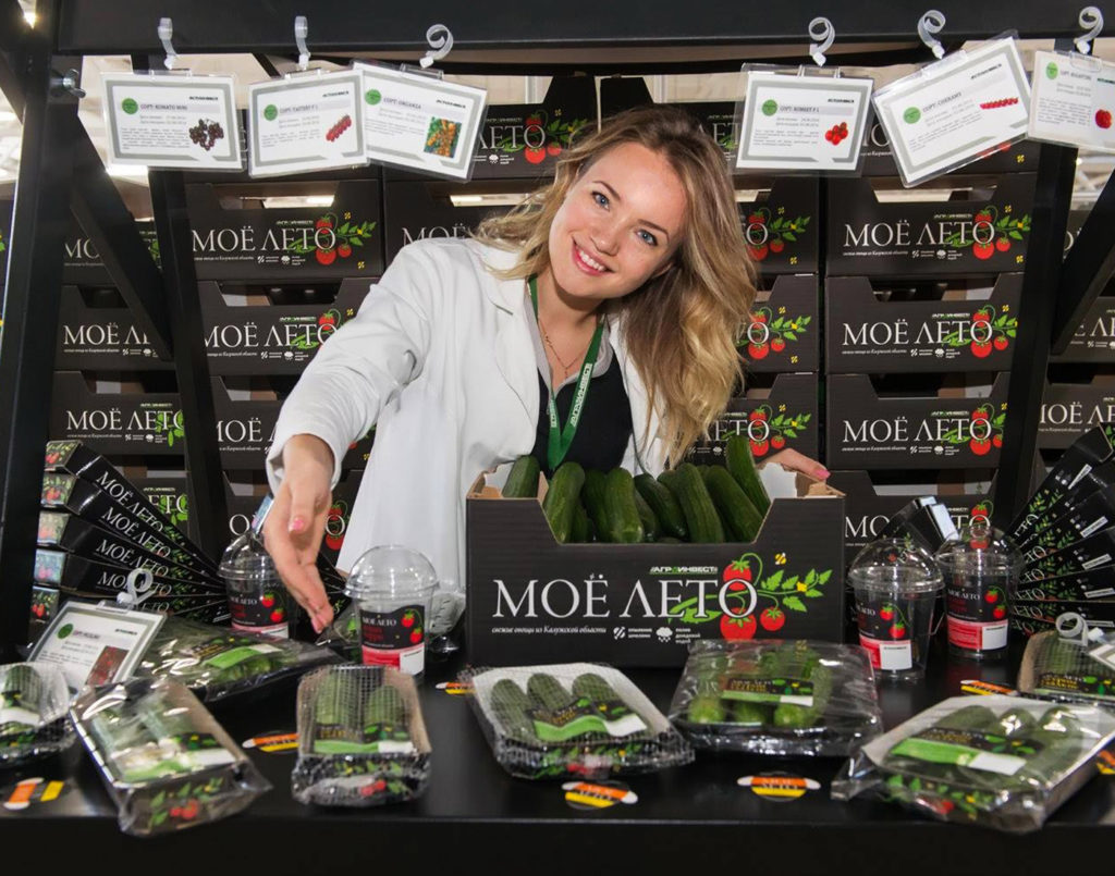
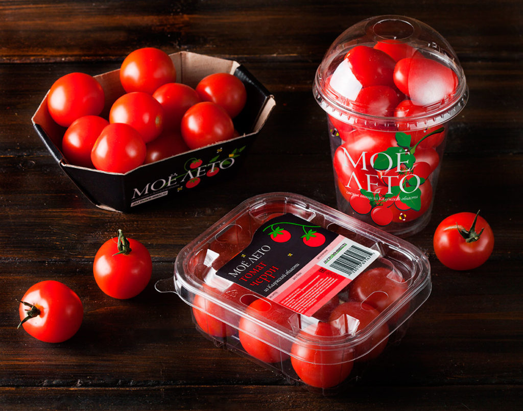
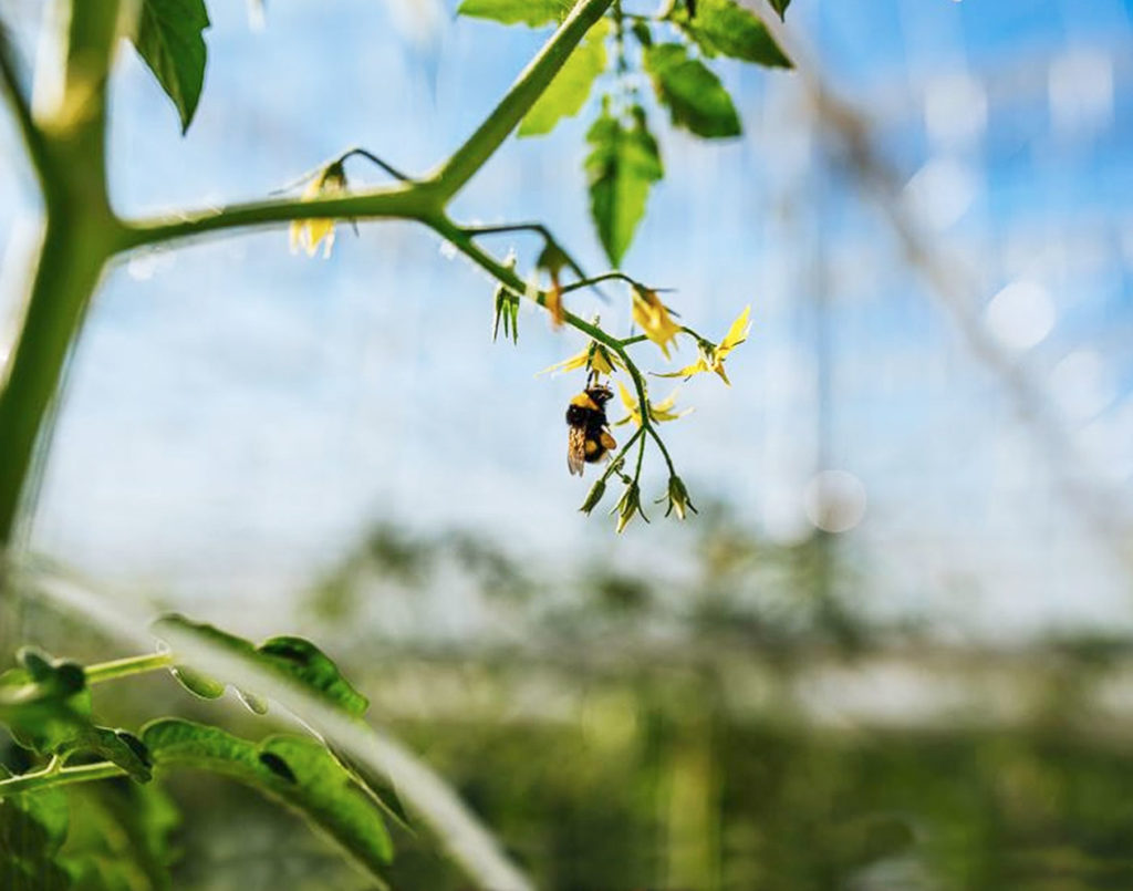
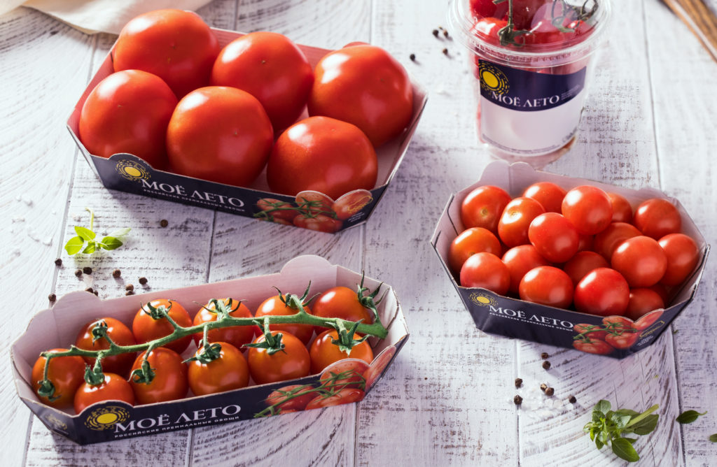
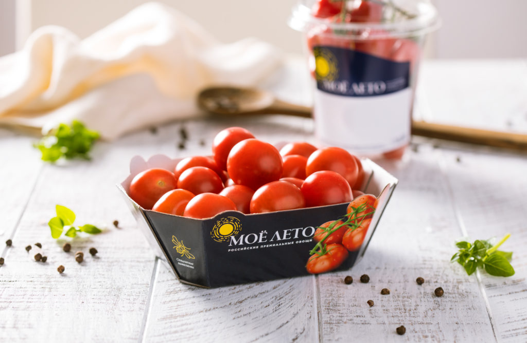
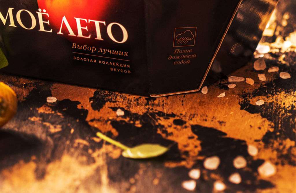
Название «Моё лето» вызывает приятные ассоциации о сезонных овощах, вобравших в себя тепло солнечного света. Актуальный плоский дизайн, нарочно лишенный деталей, ассоциируется с локальным производством, где помидоры и огурцы выращиваются с особенной заботой. Пиктограммы, расположенные на лицевой части, рассказывают, что в процессе производства особую роль играет гармония природы и технологий – опыление овощей происходит с помощью живых шмелей, а для полива используется дождевая вода. Ростки на групповых упаковках собираются в единую бесконечно-длинную ветвь, характерную для гидропонных теплиц. Благодаря такому ходу бренд-зона становится заметной с большого расстояния и лучше запоминается потребителем.
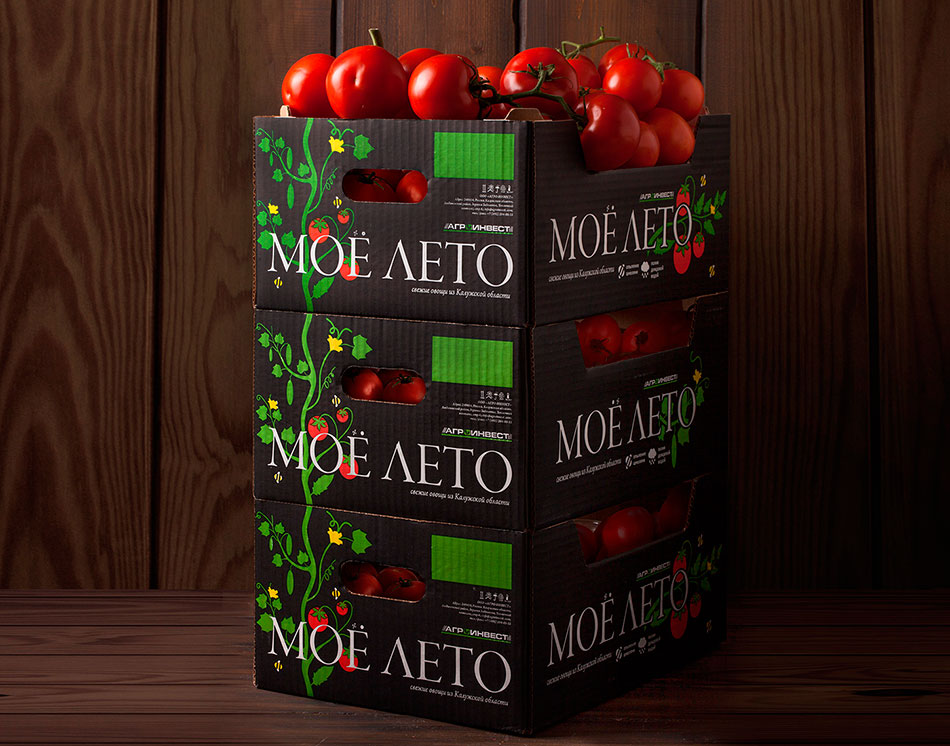
Ростки на транспортных упаковках собираются в единую бесконечно-длинную ветвь, характерную для гидропонных теплиц. Благодаря такому ходу бренд-зона становится заметной с большого расстояния и лучше запоминается потребителем.
Работа над архитектурой линеек бренда «Моё лето»
Работа по редизайну началась с формирования новой архитектуры бренда «Моё лето». В её основу легло особое отношение специалистов Агро-Инвеста к процессу выращивания овощей. Для агрономов-селекционеров работа по созданию новых сортов является страстью, возведенной в ранг искусства, а простые покупатели становятся ценителями этих произведений. Поэтому на смену обычным линейкам пришел принцип формирования архитектуры портфеля из «коллекций продуктов».
Массовые, популярные сорта продуктов объединились в «Базовую коллекцию», редкие селективные сорта – в «Золотую коллекцию», фрукты со всего света – в «Импортную коллекцию». Любая новая линейка становится коллекцией новых вкусов, новых гастрономических впечатлений, тем самым подчеркивая основу работы Агро-Инвеста – серьезную селективную работу.
Обновлённый дизайн «Базовой коллекции» играет на территории вкуса и премиальности: минималистичная и «чистая» упаковка привлекает своей лаконичностью. За преемственность по отношению к предыдущей версии дизайна отвечает черный цвет и значок солнца в лого-блоке.
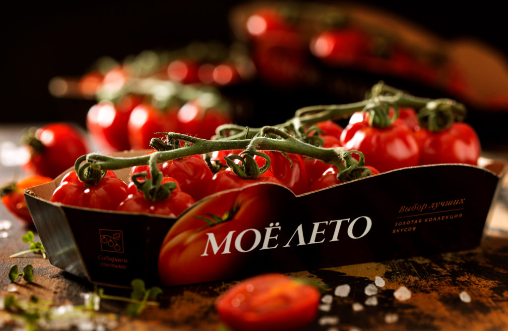
«Золотая коллекция» — вершина селекционного искусства команды Агро-Инвест, такие уникальные сорта томатов, как «ордене россо», «мамма миа», «дионис», «дольче россо», «аджилитто». Они требовали вывода в отдельную линейку, потому что в рамках одной линейки потребителям было сложно понять, почему цена на помидоры может так сильно варьироваться. «Золотая коллекция» продается небольшими партиями в премиальных сетях и гастромагазинах, отвечая на запрос тех потребителей, которые разбираются в качестве и вкусе томатов, также осуществляются поставки овощей в рестораны — качество овощей линейки «Золотая коллекция» может удовлетворить запросы самых требовательных шеф-поваров. Именно поэтому новый слоган линейки «Золотая коллекция» звучит как «Выбор лучших».
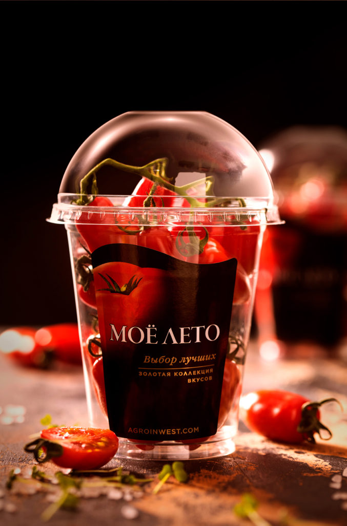
При разработке дизайна мы сознательно дифференцировали «Золотую коллекцию» от базовой линейки, сохранив при этом узнаваемость бренда. Логотип приобрел более утонченное и элегантное начертание, а на упаковке появились более приглушенные, сложные цвета. На одной из граней упаковки появляется ссылка на сайт, где потребитель может познакомиться с пользой и вкусовыми характеристиками каждого конкретного сорта, изучить путь, который проделал каждый сорт: от родных плантаций и кропотливой работы по адаптации до ручного сбора и калибровки по размеру и форме в каждой упаковке. «Золотая коллекция» не кричит на полке, она тихо дает понять, что выбор тех, кому важен неизменно богатый вкус, очевиден.
Отдельной задачей в рамках работы Ohmybrand с маркой «Мое Лето» была упаковка «благотворительной» линейки, созданной в рамках совместной акции с фондом «Подари Жизнь».
выполненные услуги
клиент
команда
Творческий директор – Надежда Паршина
Дизайнеры – Марина Малыгина, Дмитрий Кузнецов
От Агроинвеста
Виктория Бурматова