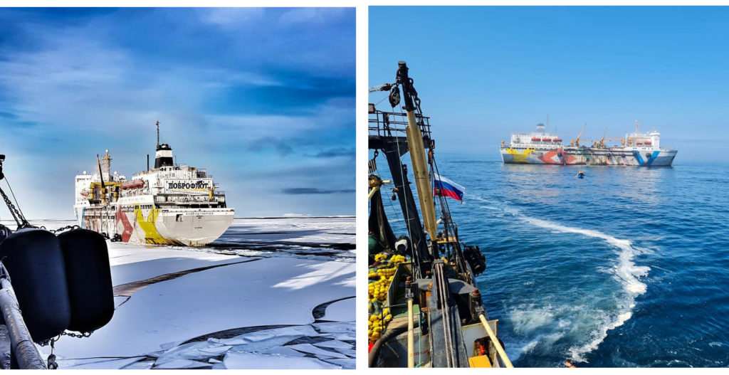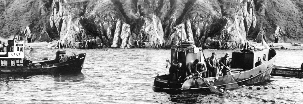
Dobroflot is a company that carries the traditions of fish production and processing, but at the same time, new equipment, new ships and new people who came to the management of the company provided it with a breakthrough into industry leaders.

Dobroflot is a modern fishing company with respect for traditions.
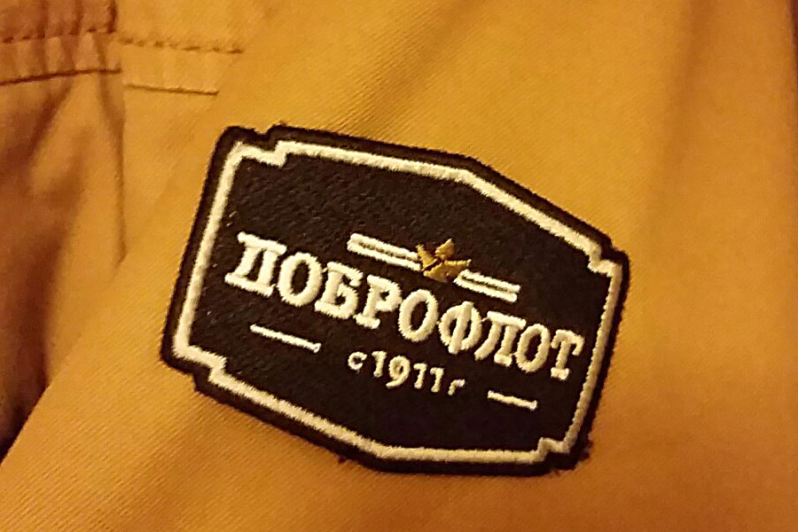


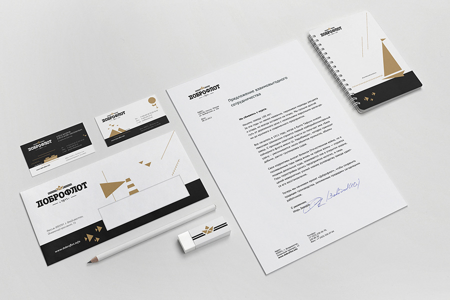
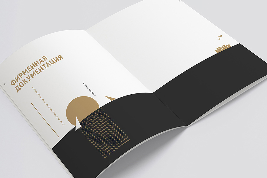
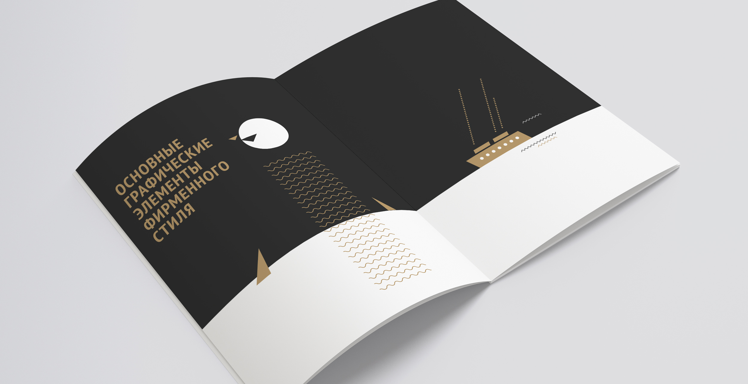
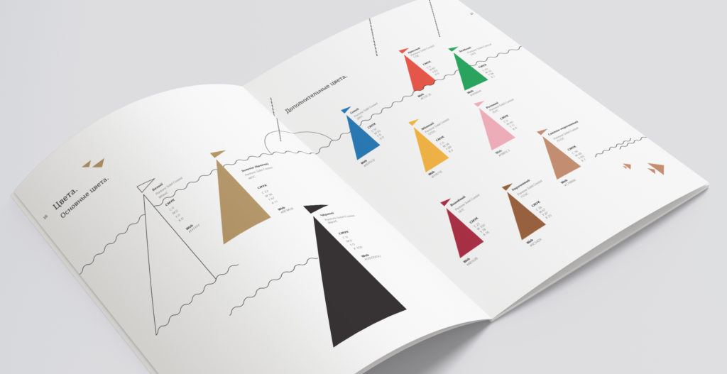
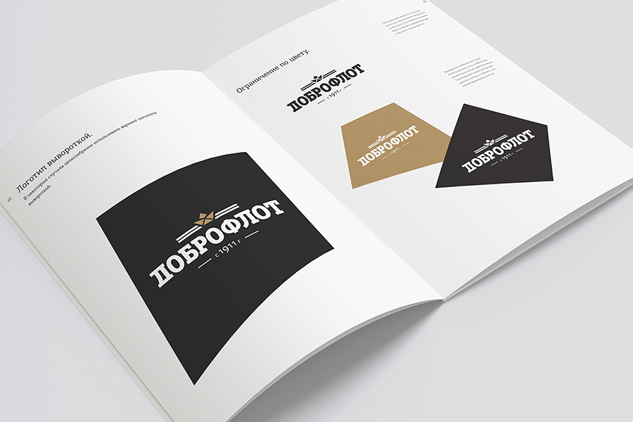
The basis of Dobroflot’s corporate identity is laconic geometric shapes. The logo and stylized graphic elements echo the constructivism of the 1920s and 30s and the traditional signaling system of naval flags. Neutral primary colors are complemented by bright accent colors – they are designed to rhyme the corporate style with the packaging of the premium line of Dobroflot canned fish