About
The Spar supermarket chain has been producing its own line of healthy food products called SPAR Natural for several years. The distinctive feature of the brand during this time has been the rich brown color of its packaging. However, with the increase in SKU on the shelves, the design began to appear gloomy and dark, so there was a need to refresh the packaging design.
Goals
The Ohmybrand agency was tasked with updating the design while taking into account the aforementioned problem and at the same time maintaining continuity. It was important for the design to emphasize the naturalness and quality of the products while differentiating itself from other private labels of SPAR and other brands and private labels in the healthy food category.


What we did
Worked on layout in the mockups: removed unnecessary elements, made the font more readable, and added new clear labels.
Introduced new natural colors to represent different product lines. The main principle was spatial zoning by distinguishing the main background from SKU color.
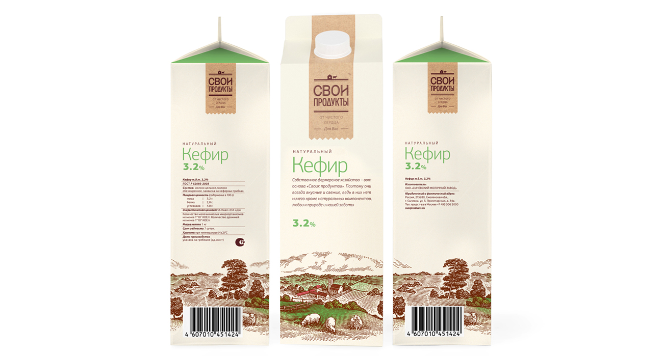
Developed a principle for working with images: kept engraving-style illustrations for some SKUs, used photographic images for others when there was no window on the packaging or an opportunity to view the product.
Created a detailed style guide with recommendations on how to use the elements of the new design.


SPAR Natural products were introduced for sale in the autumn of 2023. At the same time, we continue to work with SPAR on the redesign, helping to adapt and launch new items on the supermarket shelves.


