About
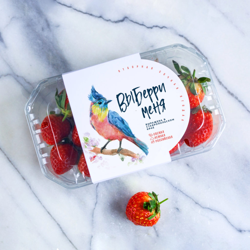
The Ohmybrand Studio has developed the packaging design for a new brand of fresh strawberries from the Stavropol region. A concise label with a bright watercolor illustration and a telling name – “Vyberry Menya” (which in Russian represents a beautiful wordplay with the words “choose” and “berry” and also evokes memories of a famous song about the bird of happiness) – can be seen from afar on the shelf of any supermarket.
Task
The Stavropol region actively develops and supports agricultural business, and many investment projects in this area have been launched in the region recently. One of them is implemented by the company “Taste of Stavropol”, which has for the first time in Russia launched the year-round production of strawberries using greenhouses. Its area is 6 ha, the production volume is 940 tons per year, and one of the key features of production is the system from the greenhouse to the shelf (the berries are shipped to delivery on the day of picking).
The new brand was supposed to reflect the local origin of strawberries, convey the festive mood and tell about the premium quality of berries. At the same time, it was necessary to think about the possibilities for scaling the brand — in 2021 the company is planning to add other berries to its portfolio: raspberries, blackberries and blueberries.


SOLUTION
The name “Vyberry Menya” and its associations to the song about the bird of happiness played a key role in this project. In Russian, the phrase has an imperative form – “Choose Me”, so it engages the consumer in a dialogue and contains a call to action, but it does not seem too peremptory due to the association with the famous upbeat song and to the wordplay with the Russian words “choose” and “berry” that have a lot in common. The handwritten font of the logo also “softens” the tone of our CTA, emphasizing its “childlike” spontaneity and sincerity.
The illustration strengthens this impression. A fun watercolor bird painted in bright, rich colors creates a sense of lightness and a mood for a small holiday that everyone of us can arrange for ourselves (or as a gift) right here and now with the help of a package of fragrant, juicy and tender berries “just from the garden”.
The other aspects of the packaging design for “Vyberry Menya” are as concise as possible. In addition to the naming and illustration on the front label, you can see just a few words about the Russian origin of berries, their quality and freshness. It is assumed that the consumer will be able to make the rest of the conclusions by looking right at the berries through the transparent packaging.