Task
To develop an integral retail brand for the farmers’ grocery stores “Two birches”.
Solution
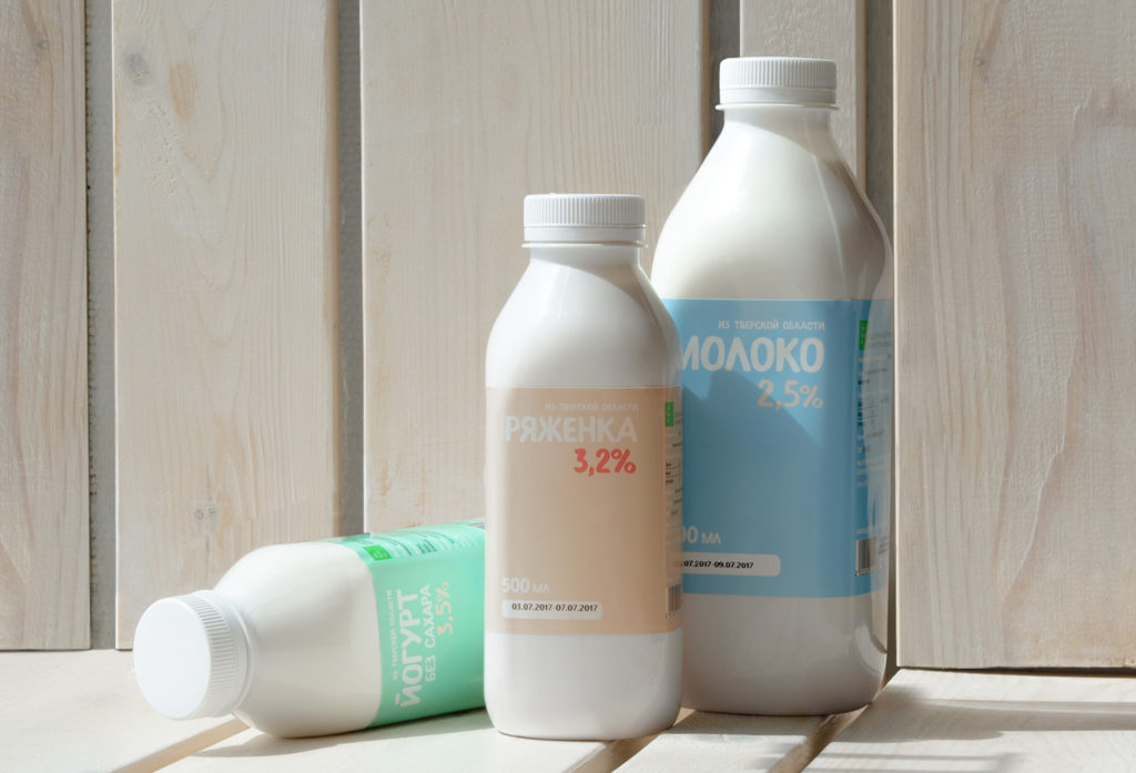
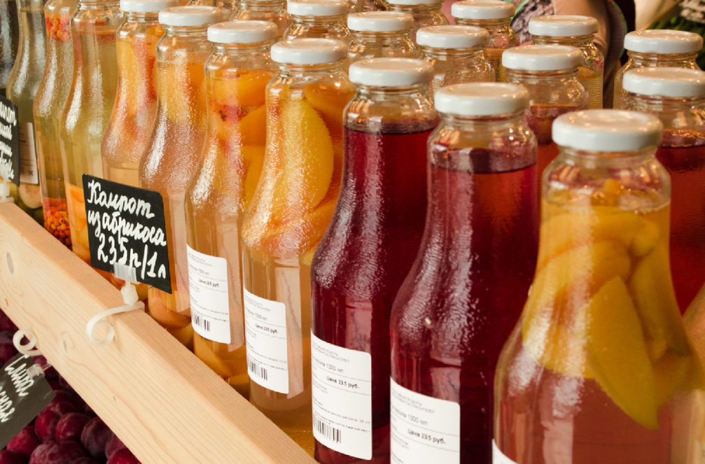
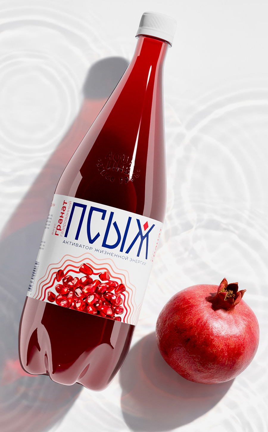
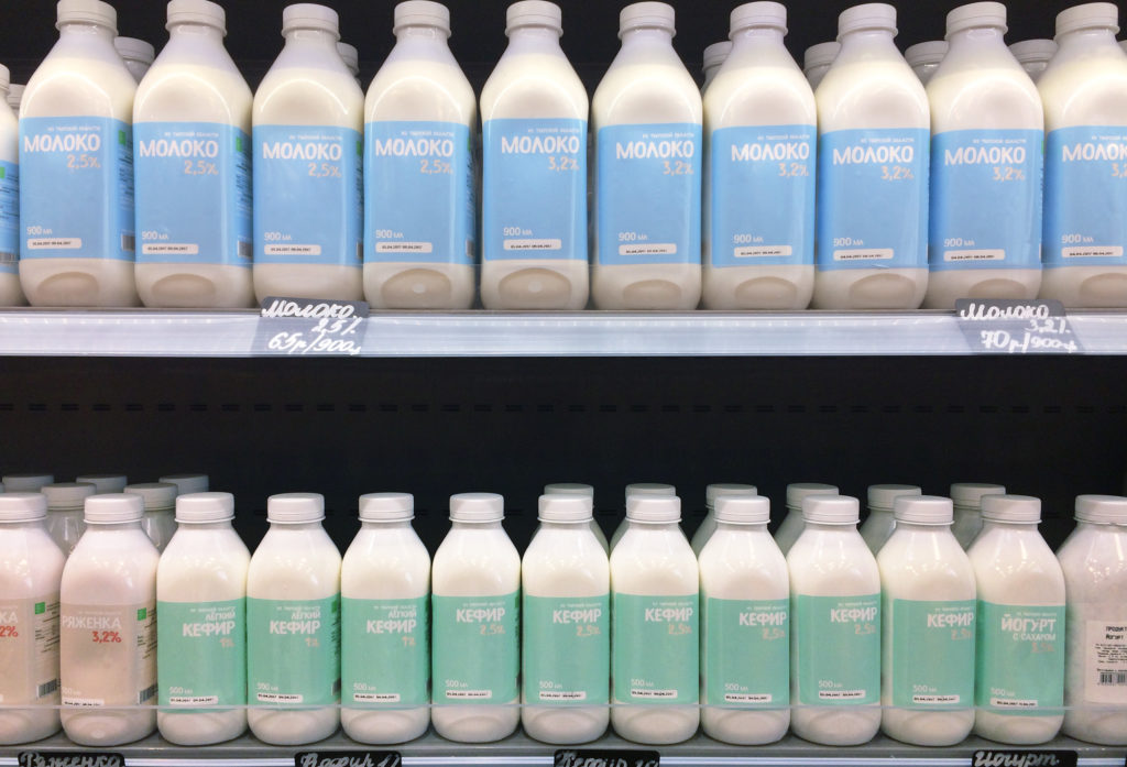
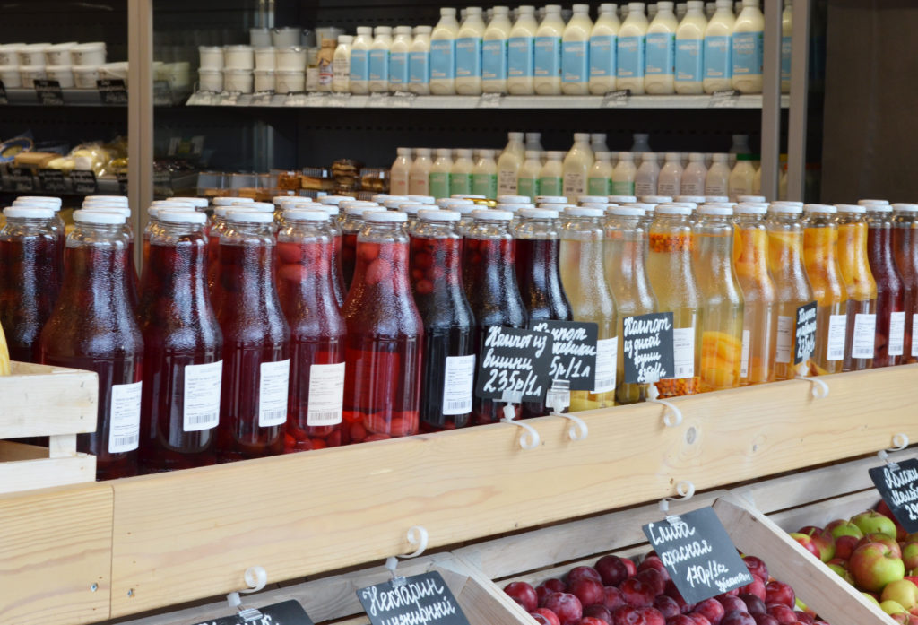
All the products from different farmers come into the store in small consignments. To simplify the workflow, we have developed two styles of packaging. The first one are clear and visible labels for branding the products on the farms, and the second option is a label that can be printed directly in the store.
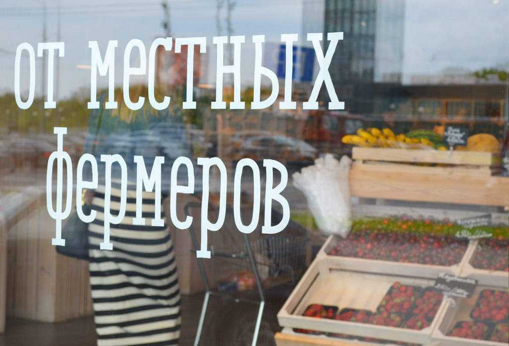
The principles of external and internal design of the stores emphasize that the products have farm origins.
The shop assistants, girls in traditional cotton aprons, greet the customers when they enter the shop.What else does a person need from a store close to home? You can quickly buy fresh, delicious food, you don’t have to spend a lot of time choosing or standing in line. Nice environment, friendly shop assistants, honest prices – and the love of the locals is guaranteed.

The Ohmybrand team began working on this project by studying the UX (user experience) of buyers and suppliers of “Two Birches” – the brand had to become attractive and convenient for both. So, for example, we took into account the fact that products from different farmers come to the store in small batches, and some of them are more convenient to brand directly in production, and the other part is more convenient to label using labels already in the store. And to simplify the workflow, we have developed two packaging design options.
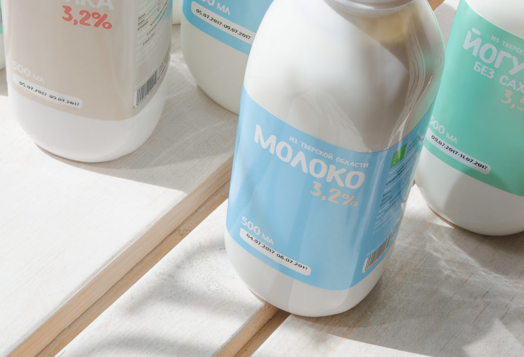
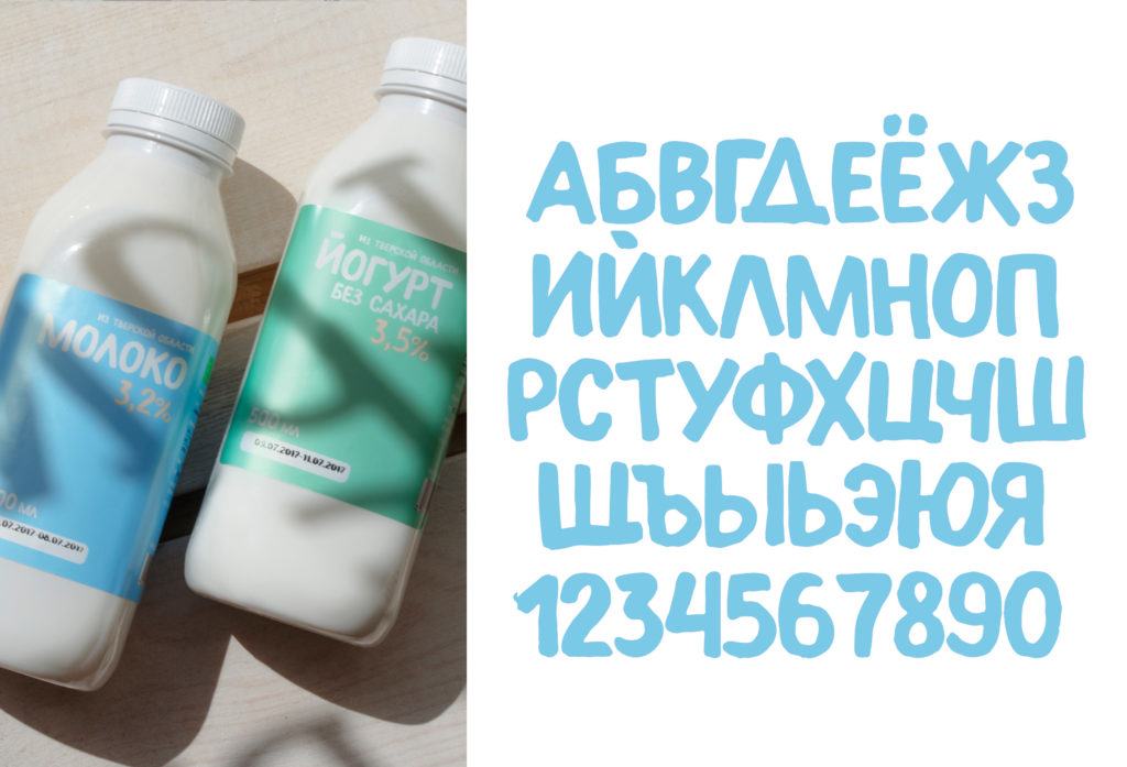
For Two Birches we developed a unique font that imitates writing with a marker. The font is used in packaging and store design.