Task
To develope a positioning and packaging for trademark of fresh vegetables “Мoje leto” (My Summer).
Solution
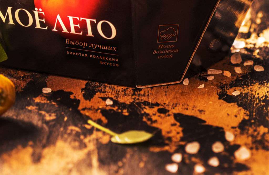
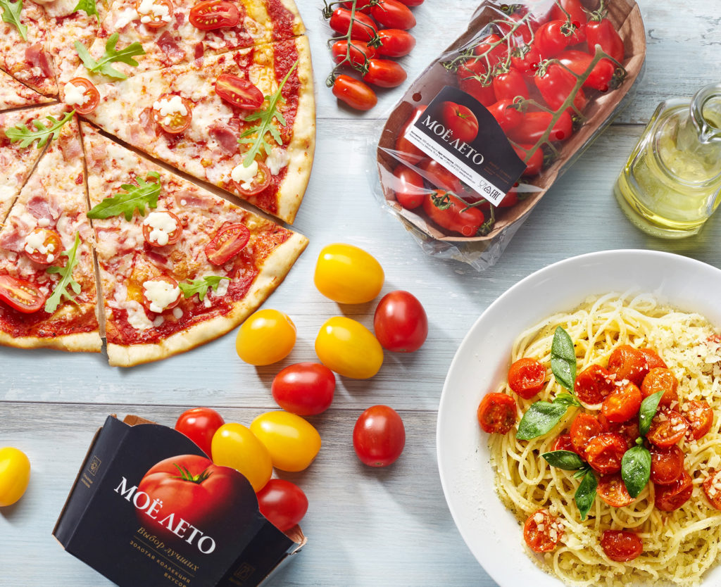
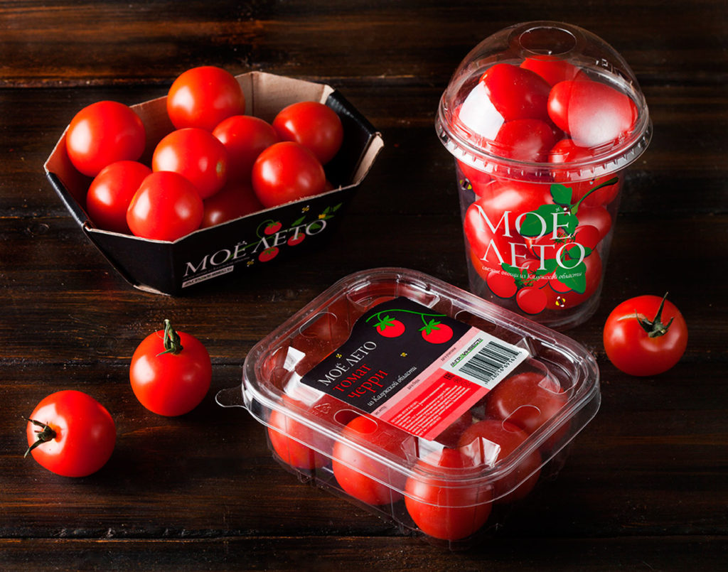
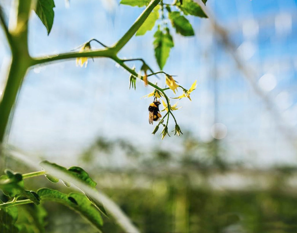
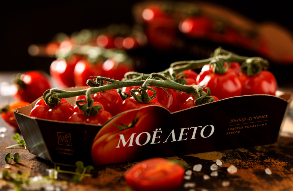
The title “Мoje leto” (means “My Summer”) evokes pleasant associations with seasonal vegetables that have absorbed the warmth of the sunlight. Trendy flat design, purposely devoid of detail, is associated with local production where tomatoes and cucumbers are grown with special care. The pictograms on the front part show that harmony of nature and technology plays a special role in the production process – farmers pollinate vegetables with live bees and water them with the use of rainwater. Sprouts on multipacks form an infinitely-long branch that is typical for hydroponic greenhouses. Due to such a trick the brand-zone becomes visible from a big distance and consumers remember it better.
And this is how the General Director of “Agroinvest” Alexey Soshnikov comments the progress made: “Despite the fact that vegetables under the brand “My Summer” appeared on the market a relatively short time ago, we have already gained the confidence of many companies. For example, Agroinvest is a reliable supplier of fresh vegetables for well-known trading networks, for example “Azbuka Vkusa”, “Perekrestok”, “Lenta”, “Karusel” and others”.
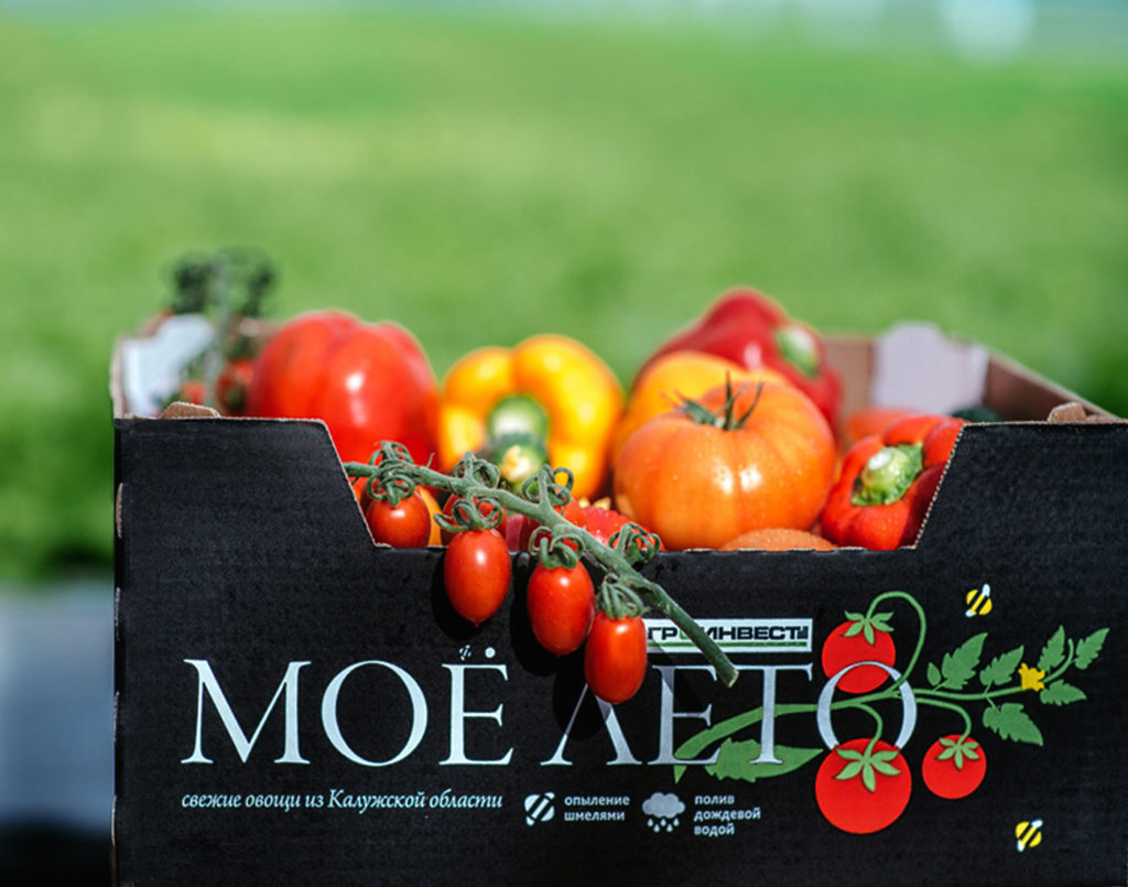
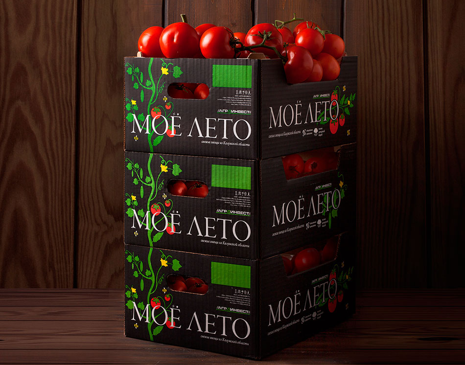
Sprouts on transport packages are collected into a single infinitely long branch, characteristic of hydroponic greenhouses. Thanks to this move, the brand zone becomes noticeable from a great distance and is better remembered by the consumer.
Work on the architecture of the “My Summer” brand lines
The redesign work began with the formation of a new architecture for the “My Summer” brand. It is based on the special attitude of Agro-Invest specialists to the process of growing vegetables. For agronomist-breeders, the work of creating new varieties is a passion elevated to the rank of art, and ordinary buyers become connoisseurs of these works. Therefore, the usual lines have been replaced by the principle of forming a portfolio architecture from “product collections.” Massive, popular varieties of products are united in the “Basic Collection”, rare selective varieties – in the “Golden Collection”, fruits from all over the world – in the “Import Collection”. Any new line becomes a collection of new tastes, new gastronomic experiences, thereby emphasizing the basis of Agro-Invest’s work – serious selective work.
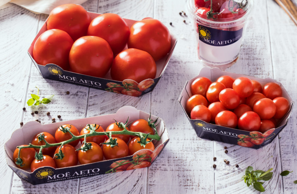
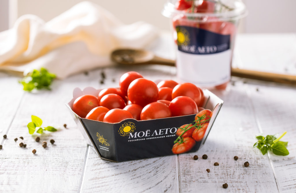
The updated design of the “Basic Collection” plays on the territory of taste and premiumness: minimalistic and “clean” packaging attracts with its laconicism. The continuity with the previous version of the design is ensured by the black color and the sun icon in the logo block.
“Golden Collection” is the pinnacle of the breeding art of the Agro-Invest team, such unique varieties of tomatoes as “Ordene Rosso”, “Mamma Mia”, “Dionysus”, “Dolce Rosso”, “Agilitto”. They required a separate line because within one line it was difficult for consumers to understand why the price of tomatoes could vary so much. “Golden Collection” is sold in small quantities in premium chains and grocery stores, responding to the requests of those consumers who understand the quality and taste of tomatoes; vegetables are also supplied to restaurants – the quality of vegetables from the “Golden Collection” line can satisfy the needs of the most demanding chefs. That is why the new slogan of the “Golden Collection” line sounds like “Choice of the best.”
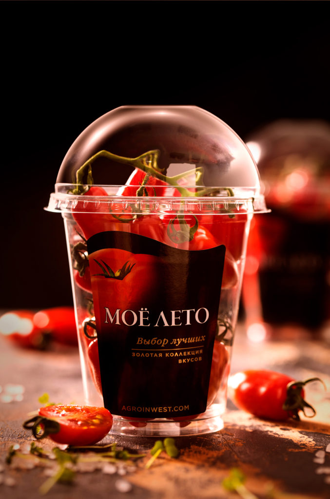
When developing the design, we deliberately differentiated the “Golden Collection” from the basic line, while maintaining brand recognition. The logo acquired a more sophisticated and elegant design, and more muted, complex colors appeared on the packaging. On one of the sides of the packaging there is a link to a website where the consumer can get acquainted with the benefits and taste characteristics of each specific variety, study the path that each variety has taken: from native plantations and painstaking work on adaptation to manual picking and calibration by size and shape in each packaging. The “Golden Collection” does not scream on the shelf; it quietly makes it clear that the choice of those who value consistently rich taste is obvious.
A separate task within the framework of Ohmybrand’s work with the “Moe Leto” brand was the packaging of a “charity” line created as part of a joint campaign with the “Give Life” foundation.